For this MVP I played an integral role in partnering with the product manager to define ideas and scope, researching how things could work, ideation, creating wireflows and building a clickable prototype for usability testing.
About The Company

InVintory is a startup with 50,000+ users and a 4.8 star rating on the App Store that focuses on helping passionate wine-collectors easily digitally manage their wines. Collectors can use the web or iOS app to keep track of their collection and co-manage it with other people.
At their stage, shipping out features fast was a priority.
Introducing Clubs
"Clubs" is a social feature available to all users that aims to help wine enthusiasts create and join communities that they're interested in. They can easily share wines from their collection, journal with tasting notes and discover wines that have been tagged in posts.

Some wireframes that I created for this project, from Version B
I did this twice
This project was split into 2 versions due to revisiting the idea after putting it on hold. When we came back to it, it was re-thought and there were many changes; this became version 2. I worked together with my design lead, who primarily handled the UI and I handled the research, ideation, flow and wireframes.
Why this was made
This was a feature ordered by the head of product to help elevate the app's experience, drive user engagement and compete with competitors that already allow socialization.
✽ Business impact
• Improve user retention and drive engagement
• Potential monetization for members-only wine clubs in the future
✦ User impact
• Offer a communal space where collectors can share wines
• Discover wines that others are drinking
Our goals
⁕Boost user engagement and retention
Improve customer satisfaction and positive reviews to attract new users
✦Create an MVP that allows socialization
Create a feature that allows collectors to share wines
Results
I fulfilled my role by researching what users currently use for how things could work, best practices, coordinated with developers on limitations and possibilities, and delivered wireflows that were used to create the final UI.

✧ Version A (2 weeks) ✧
The objectives
Version A was primarily focused on testing out the concept of this new feature, which was requested by the CPO. The objective was to provide a tangible visual representation of how the feature could potentially function and look, in order to assess the concept and associated risks. As a result, I focused on designing for a single flow that represented the most common journey - posting.
Exploring user content
I looked into existing groups on Facebook to familiarize myself with what wine-drinkers were posting. This allowed me to think about what kind of posts we should allow users to post and brainstorm additional capabilities that should come with posting. I also was able to explore what kind of groups people were making in the wine community. Some posts I found were about a wine with notes, tasting events, and vineyards.

Example of common Facebook posts for wine groups

Example of wine groups on Facebook so that I can have a better understanding of what groups people have already made
People usually posted about a personal experience with a wine, had clear close-up photos of the label and sometimes pretty detailed descriptions of the wine. These wine details could include the blend, a little bit about the winery itself, and some tasting notes.
Most of this information is already in a InVintory user's collection. Because of this, the idea of tagging wines in a post was included for this project.
Prototyping and Testing
Keeping in mind that we wanted to get feedback on the concept and usability, I made a prototype using high-fidelity wireframes and used Useberry.com for testing. The tasks I designed for were: view a post, go into a different club and make a post into a club.
I wanted to know people's impressions of the concept, if tagged wines and finding info was clear and if the navigation between switching clubs made sense.
We found that most users were able to complete the tasks, though there was some struggle in quickly understanding that the wine bottle icon would show the tagged wine. The priority of this project changed after, and it wouldn't be for another few months that we would revisit Clubs.
A short recorded example of a testing session

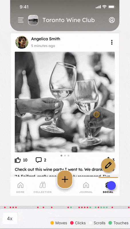
High-fidelity wireframes used for the prototype

Heatmaps from Useberry that allowed me to see where people were tapping
✧ Version B (1 week) ✧
Some re-thinking
Version B was revisited 2 months later and was conceptually re-thought. I had a requirements gathering session where I worked with the CPO to flesh it out.

Notes from my requirements gathering session with the CPO and my design lead
Sketching through the chaos
Results
I researched how things could work, best practices, coordinated with developers on limitations and possibilities, and delivered wireflows that were used to create finished UI.
In Retrospect
With additional time and resources, conducting thorough research (like interviews) on how wine enthusiasts use their current social groups could have revealed valuable insights into their pain points and limitations of those apps. Uncovering those problems would allow us to create solutions and bring more value to Clubs.
This is important because we must recognize that users migrating from a social group that they've been a part of for some time is very challenging to move away from and requires significant effort.
✷ You've reached the end, thanks for reading! ✷